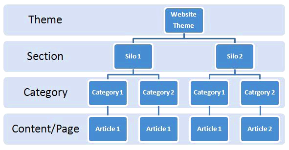
- It is the control of visual information in an arrangement or presentation to imply importance.
- Attention is draw the most important information within a composition.

Hierarchy levels

- In design, hierarchy is used to
- Add emphasis
- Create direction
- Create organisation
- Hierarchy can express itself in many visual ways such as in color, contrast, scale, size, shape.
- Color:
- An element will appear more hierarchical if it's color is different than other elements color in a design.
- We naturally look first at the different color element in a design.
- Bright colors usually draw greater attention than duller hues.
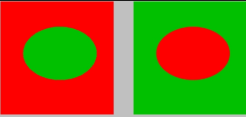
- Dramatically contrasted colors will catch the eye easily.
- Placing a red object against a green or black background will draw more attention than the same red object on an orange or purple background.
- Scale:
- Here we have some stroke lines going from thick to thin, from top to bottom in eight steps.
- The hierarchy of scale in these eight steps also suggests direction of hierarchy.
- The flow of importance here starts from the top and travels down from thick to thin.

- Size:
- An element will appear more hierarchical if it is larger than other elements in a design. We naturally look first at the larger element in a design.
- It’s the precise reason why newspaper headlines appear in larger fonts, and major stories often have even larger headlines than articles on the rest of the page.
- Shape:
- An element will appear more hierarchical if it's shape is different than other elements in a design. We naturally look first at the different in a design.


