Serif
- It is a small decorative line attached to the end of a stroke in a letter (or) symbol.
- Serif have been credited with increasing readability and reading speed of long passages of text.
- These are used for lengthy text, such as books, news papers, and most magazines.
- Examples, Times New Roman, Georgia, Baskerville.

- Serif fonts can be broadly divided into four groups:
1. Old style
2. Transitional
3. Didone
4. slab serif
1. Old style:
 3. Didone:
 4. Slab serif:
 San Serif

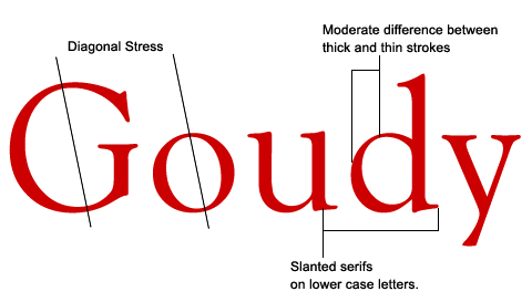
- These are based on hand lettering of scribes and first appeared in late 15th century.
- Their relation can be seen in the curved strokes and letters with thick to thin transitions.
- These are always angled and if you draw a line through the thinnest parts of letters, we will see the stress in diagonal.
- During this period, italic letters are evolved.
2. Transition:
- It was appeared in mid 18th century.
- This represents the transition between old style and didone.
- The axis of curve strokes can be inclined in transitional designs, the strokes normally have a vertically stress.

- It was appeared in late 18th century.
- Contrast between thick and thin strokes is abrupt.
- These have a vertical stress and with no bracketing.
- In many cases, stroke terminals are "ball" shapes rather than an evocation of broad pen effect.
- These are less considered to readable than trans (or) old style.

- Slab became popular in 19th century using for advertising display.
- These have very heavy serifs with minimal bracketing.
- Changes in stroke weight are imperceptible.
- To many readers, slab serif type styles look like San serif designs with a simple addition of heavy serifs.

- It is one letter form that does not have extending features called "serif" at the end of strokes.
- It tends to have less line width variation than serif fonts.
- These are often used for headings rather than body texts, reports, brochers.
- For other shorter text, such as captions,column headings San Sarif can be used.
- Example: Helvetica, Arial, Verdana.

- San Sarif is classified into 4 types:
2. Square
3. Geometric
4. Humanistic
1. Grotesque:
- Grotesque is the first commercial popular type of San Sarif.
- There is a slight "squared" quality to many of the curves and the lower case 'g' is common to the Roman type.
- These were often quite solid, bold designs suitable for headings and advertisements.

- These designs are based on grotesque character traits and proportions.
- It have a dramatic square of normally curved strokes.
- Usually they have more latitude in character spacing than other San Sarif types.

- These are based on geometric shapes like near-perfect circles and squares.
- Commonly features are a nearly-exactly circular capital 'o'.
- Among these four categories, geometric fonts tend to the least useful for body text and often used to headings.

- It takes inspiration from traditional letters forms, such as Roman square capitals and traditional serif fonts.
- These have stroke modulation (or) alternating thick and thin strokes.
- Humanistic designs can be given wide separation between strokes which is not a feature on grotesque.
- Most legible and most easily read of the sans serif typefaces.
